Monday, 6 June 2016

Thursday, 19 May 2016
Summer Show
Today we're demolishing our rooms and setting the boards up for the summer show. However, our tutors have not ordered in the paint so we aren't going to be able to finish it and start setting up until at least next week.
I have been coming up with different ideas of what I could have my board like, I was thinking of using wall paper and a wall sticker print to the title of my project, or to create a sticker of a lace pattern and to have it draping around my final pieces.
I think that I want to create a few pages in my sketch book, purely for the planning of my board, as our work will be marked while its all up and being presented. I'm planning to take at least two hours to plan out my board to insure that it is up to the standard that I wish it could be.
I have been coming up with different ideas of what I could have my board like, I was thinking of using wall paper and a wall sticker print to the title of my project, or to create a sticker of a lace pattern and to have it draping around my final pieces.
I think that I want to create a few pages in my sketch book, purely for the planning of my board, as our work will be marked while its all up and being presented. I'm planning to take at least two hours to plan out my board to insure that it is up to the standard that I wish it could be.
Wednesday, 18 May 2016
Boning
Here I have been experimenting with boning, I have used a mesh material and a foam strips to create a sample of this technique. I would like to use something like this or a similar technique to this is my illustrations.


Sunday, 15 May 2016
For Love and lemons
I have come across a lingerie website called For Love and Lemons, I want to analyse all of the modern lingerie styles to see how I could incorporate the styles of the 1900's into lingerie that the modern woman would wear. By analysing these styles I will then be coming up with a variety of fashion illustrations that will be reflecting both modern styles of lingerie and styles from the 1900's.
Friday, 13 May 2016
Samples
I have been playing around on the stand with the ideas of lingerie and weaving. I've created many samples of these so I can get a rough idea of how lingerie works with the fabrics I have chosen. The fabric I do have for this project was from a little fabric shop in paris, its a meshed fabric with a velvet abstract pattern attached to the material. I do feel as if this is the perfect fabric for my project as it looks and feels very sexy yet sophisticated, it also links in well with my chosen era and colour scheme.
Thursday, 12 May 2016
lingerie
I have decided to look into lingerie. I want to reinvent old fashioned underwear and slips, making them into modern day pieces that the modern woman would wear. To include language into my pieces I will be screen printing onto lace and ribbon and weaving and embroidering it into my pieces. I have experimented with this by creating my own patterned pieces through weaving paper together. I do really enjoy weaving as i get to create my own patterns, rather than using one that has already been created. I want to play around with this idea more throughout my project and my illustrations.
Wednesday, 11 May 2016
My mood board
In order to have visual stimuli for my research, illustrations and sketchbook, I'm insuring that my mood board has a wide variety of samples, textures, colours and ideas.


Monday, 9 May 2016
Im currently in the research stage of my project, where I am looking into different eras of fashion and language. I want to briefly look into all of these eras so that I can then mainly focus on one or two for my project. So far I think I will be focusing into the 1900's-1910's as I feel that this era has the biggest potential to be developed within and to reinvent the garments to make them desirable to modern day women.
Friday, 6 May 2016
The Journey of Language
The Journey of Language.
Review:
Having no barriers within my creativity, allowing my mind to wander and drift beyond all sense of normality, experimenting with techniques and patterns so unique to myself, have allowed me to progress through this foundation year. I have found the beauty of working directly onto the stand, and one day projects have pushed me to let down my barriers and work at a face pace. Life drawing has made me appreciate smaller details and how everything comes down to just being basic shape, proportion and colour.
I can now accurately recognize the strengths and weaknesses in my work, my stronger side being the making, working straight onto the mannequin. However, I now know and understand how my analysis and explanations of my own thoughts could be much clearer a well as being presented better.
These last few months of learning, experimenting and purely playing within my chosen area, has lead me to firmly decided that I want my unit 7 project to be based around fashion and costume.
Concept:
My intentions for unit 7 are to research into different types and styles of typography and language. My main aims are to look into how language has changed over the years alongside fashion trends around the same era, how some have become obsolete and the different popularity of languages. I will also be focusing on typography and text, how it has developed within language and the social standards that we have in this day and age.
I will also research ancient language and manuscripts, researching new word trends and obsolete words and phrases. I will go to library’s and museums to find primary evidence of ancient manuscripts and hand rendered books. I want evidence of how language and text has changed through society’s standards as well as major life and world changing events. I will be creating questionnaires to primarily discover facts about what my peers see as a fashion trend right now, and how trends from different eras can come back around to be reinvented into something new.
Another aspect I am intending to research into is how fashion trends run alongside word and typography trends. When looking back into how language was spoken and used 80 years ago in comparison to the main garment trends and necessities in the same era.
In order to link all of my research and findings with fashion and costume, I will be research. I of course will be utilizing all of the resources available to me, such as; Library’s, museums, darkrooms, print rooms, sewing machines, welding stations, laser printers, the internet and many more available to me. My main anticipated outcome will be a collection, or one final garment that will accurately represent my chosen theme and for my final show to reflect my whole body of work.
Evaluation:
My fashion illustrations will give me a platform to quickly and efficiently experiment with my ideas and through processes, and sketchbooks will allow me to have the opportunity to explain myself and ideas, how they all link together to create one final outcome. I am going to surpass all boundaries and barriers, pushing myself to create a body of work that fully represents the height of my ability at this point in my life and career. I will constantly reflect upon my successes and failures. There will possibly be a lot of change and adaptations within this unit; therefore I am going to be leaving room for this change. I will be keeping track of all feedback and ideas in order to allow myself to reach my full potential within this project.
596
Nicole Hofgartner
Bibliography:
The metropolitan museum
http://www.batharchives.co.uk/
Bath Fashion museum
Bath Fashion museum
Cardiff Central Library
Vintage Fashion and Couture book by Kerry Taylor
DK Fashion; The ultimate book of costume and style
DK Fashion; The ultimate book of costume and style
Friday, 12 February 2016
Gloucestershire University
I have been offered an unconditional place at Gloucestershire University to study fashion design. This is my first choice in university and I am hoping to be moving up there in September 2016. This is such a wonderful opportunity for me and I am hoping to fully embrace all of the opportunity that it could throw my way.


Wednesday, 6 January 2016
Flight
After coming back from the christmas break, we have started term two with a project based around flight. This project is very open and we can base it around our own interpretation of the word flight.
I wanted to avoid the obvious themes of flight such as birds, planes and feathers. Instead I am basing my project around 1900's transport such as hit air balloons, trains, cars, bikes, horse and carriages. I came to thinking of wanting to do this from the film 'The Great and Powerful Oz', in the very beginning scenes of the film when they are in Kansas, the setting is a circus. What made me think of this was the tornado which carried oz to Munchkin land, their flight in the tornado, however, I am going to be taking inspiration from the era and the hit air balloon which carried oz into the Munchkin land.
I do feel as if I will really enjoy this project, I can see a lot of potential designs and pathways that I could take this project with.

I wanted to avoid the obvious themes of flight such as birds, planes and feathers. Instead I am basing my project around 1900's transport such as hit air balloons, trains, cars, bikes, horse and carriages. I came to thinking of wanting to do this from the film 'The Great and Powerful Oz', in the very beginning scenes of the film when they are in Kansas, the setting is a circus. What made me think of this was the tornado which carried oz to Munchkin land, their flight in the tornado, however, I am going to be taking inspiration from the era and the hit air balloon which carried oz into the Munchkin land.
I do feel as if I will really enjoy this project, I can see a lot of potential designs and pathways that I could take this project with.

Tuesday, 17 November 2015
Fashion and Surface Design -
We have been given architecture to focus on for our fashion and surface design project. As soon as I found out what our project brief was, I immediately went onto Pintrest to search for garments and inspiration for this project. When I was on Pintrest I came across this page which purely shows white architectural objects and buildings. The pure colour scheme and the plain, yet intriguing look interested me. From there, I decided to look for pastel and white architecture, which is when I came across Russell house in Covent gardens in London.
While i was drawing up my sketches and ideas, i realised that i was going more towards fashion rather than surface design, which then lead me to do fashion illustrations of dresses and light flowing garments, which were all in pastel colours. However, i found that in most of my research the buildings and architectural objects had all had straight, flat edges, so I decided to try and incorporate this into the floaty garments.
I have also decided that I am going to be using a screen print technique in my final garment. In order to get the clean cut edges of the skyline and buildings that I wanted, screen printing would be the safest option. I can then paint over the screen print over the screen print by hand once it is dried to finish the final look of the garment.
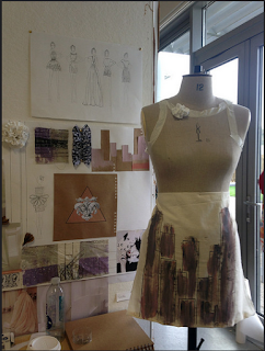


While i was drawing up my sketches and ideas, i realised that i was going more towards fashion rather than surface design, which then lead me to do fashion illustrations of dresses and light flowing garments, which were all in pastel colours. However, i found that in most of my research the buildings and architectural objects had all had straight, flat edges, so I decided to try and incorporate this into the floaty garments.
I have also decided that I am going to be using a screen print technique in my final garment. In order to get the clean cut edges of the skyline and buildings that I wanted, screen printing would be the safest option. I can then paint over the screen print over the screen print by hand once it is dried to finish the final look of the garment.


Photomedia
I have now all finished my photomedia project! I did really enjoy this project and I feel as if my work has already improved from the first project that we did. I used photoshop to manipulate photographs that I had taken in the studio, cutting away the faces of the subjects in the photographs and replacing them with scenic images. I do feel as if this really portrayed my idea of rapprochement as it shows the harmonious relations between people and nature. Also by cutting away the faces of the subjects in the photograph, it gives them no identity, a clean slate, it makes them new.


Photomedia - Rapprochement
This week we were given new projects, for this particular one in photo media, we were given a dictionary in which we had to pick a word at random to base our project around. My word was 'Rapprochement'! As I didn't know much about this word my first step was to find the definition, which happened to be 'an establishment or resumption of harmonious relations'. My initial thoughts when I first read this were identities and relationships. It was about people, countries, things coming together and being combined to one.
Within this project I would like to really portray rapprochement through people and their identities, making them into something new.
Within this project I would like to really portray rapprochement through people and their identities, making them into something new.
Monday, 5 October 2015


Wednesday, 16 September 2015
Week 2 - Experimentation
This week I have been experimenting with
many different materials and surfaces, which could be used to place my images
on.
I went into a graphic design warehouse
called Teklagraph to use their exposure and dark room to print onto metals. I
used my film roll to expose the image onto the light sensitive metal. This
worked extremely well and made me wonder about what else I could do with the
photographs that I had taken. I could experiment with the laser cutter with my
images on many different materials such as fruit, wood, fabric, metal and other
materials. I could also print my photographs onto the different surfaces or
stickers.
I now have a rough idea of whatI would like to do for my final pieces within this project, I would like to use one of my photographs and cut through it to create holes in the paper, this is so when I hold it up to the light you can see the light and background come through the image in the shape of what the image itself is. I had experimented with this when we went to uphill and Sandbay to sketch. This was one of my favourite techniques that I had experimented with as the end effect was astonishingly beautiful. However, when I first did this technique, I used paper, however when I held it up to the light, the paper flopped and folded, so the next time I do this, I would like to use metal to make it sturdier.
My sketch book is also coming along well, as I've been doing a lot of artists research and annotation of my images and experiments.
I now have a rough idea of whatI would like to do for my final pieces within this project, I would like to use one of my photographs and cut through it to create holes in the paper, this is so when I hold it up to the light you can see the light and background come through the image in the shape of what the image itself is. I had experimented with this when we went to uphill and Sandbay to sketch. This was one of my favourite techniques that I had experimented with as the end effect was astonishingly beautiful. However, when I first did this technique, I used paper, however when I held it up to the light, the paper flopped and folded, so the next time I do this, I would like to use metal to make it sturdier.
My sketch book is also coming along well, as I've been doing a lot of artists research and annotation of my images and experiments.
Wednesday, 9 September 2015
Land and Water - Week One
This week we were given our first project; Land and Water. Our brief for this project was to explore the environments around us, marking down anything that inspires us or any emotions that these environments inflict upon us.
Our class headed down to Uphill for the afternoon to do some sketches and to get a feel of what our project was going to be like, however, as I am basing my project around photo media, I also used a Pentax K1000 film camera to capture to beauty of the atmosphere.
My main aim was to combine Land and Water together using both sketches and photography, to do this, I sketched a tree and cut out the leaves which left holes in the paper. When I had finished I held the paper up to the background of the place I had been studying and took a photograph. The result of this was the leaves having the same pattern and picture as the background behind it. This way, I had combined land and water together into one collective piece of work. I felt as if this was the most inspiring and accurate way to represent the scenery around me, it not only illustrated the visual scenery, but the emotional, peaceful atmosphere as well. I then went on to use this same technique in other locations with different patterns and shapes to be made.
Our class headed down to Uphill for the afternoon to do some sketches and to get a feel of what our project was going to be like, however, as I am basing my project around photo media, I also used a Pentax K1000 film camera to capture to beauty of the atmosphere.
My main aim was to combine Land and Water together using both sketches and photography, to do this, I sketched a tree and cut out the leaves which left holes in the paper. When I had finished I held the paper up to the background of the place I had been studying and took a photograph. The result of this was the leaves having the same pattern and picture as the background behind it. This way, I had combined land and water together into one collective piece of work. I felt as if this was the most inspiring and accurate way to represent the scenery around me, it not only illustrated the visual scenery, but the emotional, peaceful atmosphere as well. I then went on to use this same technique in other locations with different patterns and shapes to be made.
Dismaland
One of the art exhibitions that I visited over the summer was Banksys controversial bemusement park, which displayed his own and over 50 other artists work.


The beauty and detail behind each individual work of art was astonishing, each piece had a deeper meaning as well as portraying current issues and problems in the society we live in today. Instead of sugar coating the major problems and issues that surround us, it made them into very intriguing pieces of art which made you question the world that we live in today.


I believe that the main reason Banksy's Dismaland appeals to me so much os the sheer raw beauty and ugliness of the world and art combined. The most interesting and meaningful piece of art that i came upon was the posters by WastedRita. This artist plastered walls in somewhat conteroversial love and sex sayings, break-ups and emotions. The simplness of her art is one of the main aspects that interested me, as well as the emotional value behind the work.

In my own personal work I like to focus on the emotion and meaning, there is fire and emotions, it makes you stop and think. That is what I aim to have my own personal work represent.
Subscribe to:
Posts (Atom)